Luup Announces New Logo and New E-Scooters with Improved Visibility
Will release a series of contents for the safe social implementation of e-scooters
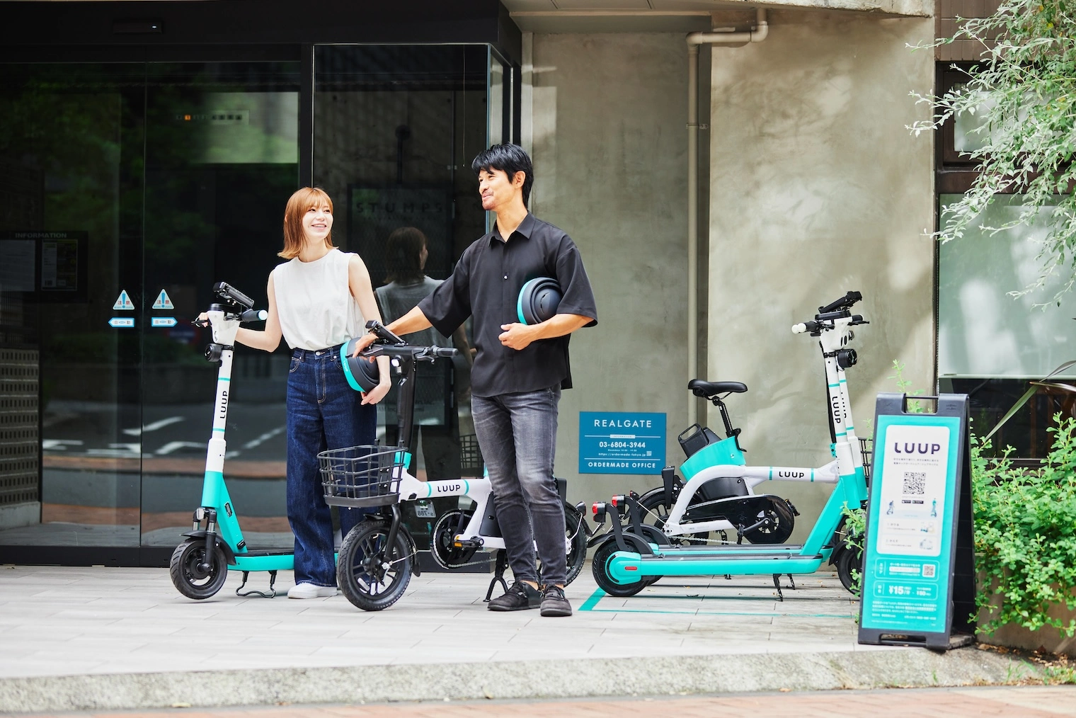
Luup, Inc. (Head office: Shibuya-ku, Tokyo; President and CEO: Daiki Okai; hereinafter “Luup”) has updated the logo of its electric micromobility sharing service, LUUP. In addition, new e-scooters with improved visibility will be unveiled. To celebrate this, we will be releasing content under the title of “LUUP for your City” to provide a deeper understanding of Luup’s past efforts toward safe social implementation of e-scooters and the future that we are aiming for.

Background
Luup is developing a micromobility sharing service “LUUP” with the mission to “create an infrastructure that turns the entire city into a ‘station front.’” In addition to e-bikes and e-scooters, Luup offers a comprehensive range of electric, compact, and single-seat micromobility vehicles, and is aiming for a future in which all people can move freely, including the implementation of new vehicles that can be used by the elderly in the future.

Three and a half years after its establishment, Luup has revamped its corporate and service logos and improved the visibility of its e-scooter design in order to become a more familiar presence in the city and move forward to become a next-generation infrastructure that supports daily first and last mile transportation.
The Concept of the New Logo
With LUUP, transportation becomes an easy and enjoyable experience. Free from transportation restrictions, users will be able to visit all kinds of places, and users will be able to enjoy the city like never before. The renewed logo was designed based on the concept of “expand you” based on the value that LUUP brings. Inspired by the relaxation curves used in transportation engineering, the new logo depicts a “U” with multiple curvatures to create a gentle form, expressing the physicality of people riding the LUUP and the light and free movement they can enjoy. The frame lines surrounding the logo are based on the lines of the stations where the LUUP vehicles will be placed. (Designed by kern inc.)

Update of E-Scooters
We decided to change the design because we wanted to express the value that LUUP brings not only in the logo but also in the vehicles, and deliver it to everyone in the city, and also because we thought it was necessary to improve the visibility of the e-scooters further as we aim to become a next-generation infrastructure.
The color scheme of the vehicle consists of LUUP GREEN, white, and black, the original brand colors, which are designed to blend in gently with the city as infrastructure, but also to evoke a sense of progress and luxury. In this renewal, the upper part of the aircraft is white and the lower part is LUUP GREEN, designed to impress the brand color while giving a sense of openness and freedom. To date, Luup has undergone 11 updates to improve the stability of the e-scooter and the operability of its various parts, in order to ensure safe riding. The transition to the new e-scooters will begin in Tokyo. We will consider introducing them to other areas in the future.


